Having one direct Call To Action is an effective way to guide your users into actions you would like them to take. In this example, we are going to show how effective this can be when used in stark contrast to walls of text. Whether you are writing an article, creating an educational post, or trying to build a better brand, we can all understand how an effective and vibrant Call To Action guides the users eye.
 $18.00
Also on display here is hiding of the quantity field, utilizing the min/max functions in the block, only adding 1 product at a time. The min/max functions do not prevent a purchase based on the min/max values, but will reject someone trying to add more to their cart from using these buttons.
The buttons shown here are the most flexible variants of the blocks available, utilizing CSS to make the interesting variations of display shown throughout the website. If you have submissions you would like us to present, you can reach out using our contact form!
Using the same block with some slight modifications, we can actually see here that we can create a full width banner as an effective Call To Action, promoting a product or browsing habits as well.
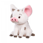
Pua the Hawaiian Pig Plush Toy
$18.00